I think I did good with the car and it actually looked like it was being consumed by the tsunami. I think I could have improved on the look of the tsunami because it looks laggey.
Thursday, May 19, 2011
Thursday, May 5, 2011
My name with a pencil.
I think I did good on the font and the design of the pencil. I could have improved on the pencil because it does not look good at the letters u and s.
My Pool Table!
I think that I did good with the movements of the pool table balls. I could have improved on the design and the speeds of the balls.
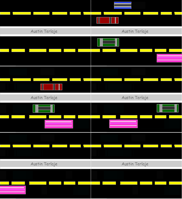
Traffic!
I think I did with the road and the speeds, and mostly the designs. I think I could have improved the look of the cars because I got lazy.
Tuesday, April 5, 2011
Catalog
I created these catalogs because I wanted to show American eagle and Holister summer clothes because I like American eagle clothes, I wanted to use the background to give the feel that summer is here. I think I did good with the backgrounds and the clothes because I picked them myself. I think that I could have done better with the text and the pictures because it looks very sloppy and rushed. フォトシヤプがだいきらいです。
Tuesday, March 29, 2011
My Logo!
I created this design for my logo because I wanted to show my name in a cool way. I think I like my black and white theme for my name. I think I could improve on the colors because some people might think that black and white is plain, I could have change my colors to like blue and black or white and silver. I think I did good on the designing aspect of my logo because I think that I represented my name pretty well.
T-Shirt!
I created this T-Shirt design because I wanted to show my nationality, Chap stands for Chamorro and Japanese.I think I did good with changing the color of the Japanese flag and the Guam seal because I had to change a lot colors and adjust a lot of stuff before I could actually put it on the T-Shirt. I could have done better with the pictures and the japanese sun because it looks really weird and to me it does not blend well
Tuesday, March 22, 2011
Movie Poster!
I created this movie poster by using the magnetic lasso to crop out my face from another picture and put my face in, Then I changed the color slightly then change the texts so I could make it mine. I think I did good with cropping out my face, and With changing the texts. I could have done better with the quality of the picture, my face looks distorted.
Book Cover!
`
I created this by clip masking mostly every thing like the spine, and I incorporated most of the blood. I think i did good with the clip masking and the text, and most especially with the Blood! I could have improved on the quality of the picture and the last names. Overall I think I did good.
I created this by clip masking mostly every thing like the spine, and I incorporated most of the blood. I think i did good with the clip masking and the text, and most especially with the Blood! I could have improved on the quality of the picture and the last names. Overall I think I did good.
Thursday, March 10, 2011
My Self-Portrait!
I created this design because i wanted to show my friends, Godspell, Quicksilver, and having a good time with my friends. I did right with the text and the picture choice because i think that the picture selection was excellent because it describes my friends and myself mostly. I could have done better with the quality, it doesn't look seem less.
Subscribe to:
Comments (Atom)


